
How do you prepare a visually engaging graphic?
Where can we get those catchy images?
Which aspects should a researcher improve concerning his images?
All the quick and useful guides, succintly written in the article 🙂
Scientists have in general two kinds of work, which should be carried out continuously throughout their research: firstly, they conduct the research itself and secondly, communicate the results [1]. In particular, for the second point, we have seen tremendous amount of effort to provoke the mind of the readers. Among various medium to disseminate science; images and scientific illustrations have become a prevalent way to display research concept, idea, even findings in many different settings, e.g. conferences, presentations, seminar, etc.
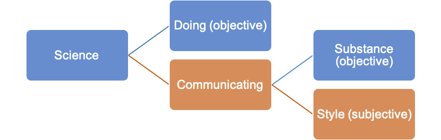
Figure 1 The roles of science, in between objective and subjective substances [1]
About a year ago, when I interned as a sustainability researcher for my final master project, my supervisor at that company always stressed the importance of having a clear message in the explanations. I learned it through the hard way on daily basis that good results might not be sufficient to convey messages to the audience. Numerous hours of arduous work may fade away when the messages are badly shown. Apparently, we need additional key ingredients: the supporting and vivid scientific images.
It may sound daunting at first, but usually scientists have these simple choices: either go for a professional scientific illustrator or make it on their own. The former is undeniably more straightforward because in this way, both the artists and scientists can assure the quality of images. In addition, working with professionals is a surefire way to save time invested during the preparation of our work; several scientific works indeed are energy intensive. The impact can even be quadrupled when perfect image is generated out of the collaboration, as depicted herein [2]– The author moreover quoted, “If you have got a story you want to get out there and you have got a really good image, it will fly farther than just words”.
However, this path comes with a price that might hinder some projects to take such approach, as the range could span from $100 – 3000 per page, depending on the quality [3]. Without disregarding the eternal feedback loop, the results might not fulfill our expectations immediately, ending up finally borrowing our time much more than necessary. Therefore, the ultimate goal of this article is to share some tricks on how to make high quality scientific images that can be done practically, given some touch of creativity. In simple steps, hopefully, by reading this you would get motivated even more to unleash the hidden potential of your research!
1. Best friend always stays around: PowerPoint
This standard application really shines nowadays, as the features are continuously updated, and it allows many enchanting shapes to be combined beautifully. Altering the background of images, however, remains as one of my favorite features on PowerPoint, since the icon can be perfectly blended into the page. Furthermore, drawing “Freeform” shapes has never been better; its flexibility can give you some edge like a pro artist, especially this one is installed as a built-in, waiting for you to access and utilize it. A clear winner in a tight deadline, scientists can always rely on it without depending that much on external illustrator. Now, you do not have any other excuses to this classic yet handy tool. Firing up the software, nonetheless, should be done later when you have some ideas on what to create [4][5]. The process in Figure 2shows how it is transformed.
|
Rough concept |
Finished drawing |
|
Splitting sulfidic tailings into two major pathways:
Extra points: add clear and ‘instantaneously comprehensible’ icons with three separate columns for better clarity, limit the colors palette (up to two or three variants)
|
|
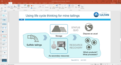
Figure 2 A bit of simple artwork would aid concept understanding
A small tip about PowerPoint: There is a “morph” transition on PowerPoint, which would make your slides movement as sleek as it can be. Go give it a test.
2. High resolution images, better use it at the right portion
People say that picture speaks a thousand of words, but which pictures are they talking about? Which one engages the audience the most? If one recklessly chose the wrong image, aggravated by low quality photo, the quote does not sound as nice as it was. In contrast, with a correct and high definitive photo, we can create a solid delivery that will leave a remarkable mark on audience’s mind, even after the session finishes [6]. We, of course, do not want to end up with a slide like this one (Figure 3).
*Figure 3 Full text and background image: they do not cooperate well
Unless people have different visual tastes, we could agree that most of the time, being spammed with text and image can be too obtrusive. In the light of solving this issue, we can definitely circumvent such combination with a little bit of experimenting with other elements – more importantly, sharp photos can be sourced freely from sites like Unsplash or Picjumbo.
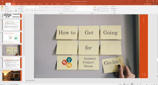
*Figure 4 Alternative way: a background image that helps empowering the content
*A project to educate individuals on how large their travelling or commuting environmental impact
A small tip about Images: Sometimes we do not need the whole image in the frame. Cropping at the right portion might be your best friend to accentuate certain elements.
3. Putting simple icons and logos
Simplicity has become a new norm nowadays in many settings that involve visuals. Making icons that blend perfectly into the content, however, is not that straightforward process, especially if time is pressing you. Therefore, a bank of inspiration where we can download or imitate would extend our research lifeline without a doubt. As Picasso said, “good artists copy, great artists steal”. Some useful sites to cater your thirst of good icons and logos are: the noun project, flat icon, icon finder.
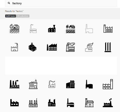
Figure 5 Plenty of choices gives you a lot more possibility to tweak your illustrations
A small tip about icon: Unicolor works best in a poster or presentation. Again, nothing beats simplicity and you can draw audience towards the main messages instead of distracting them with awful elements.
4. Getting a little bit advanced with Adobe family product (or similar apps)
Suffice to say, Adobe or other software can be suitable for poster making if you really want to up the game. Personally, it is not encouraged to use it for first timers, as it has slightly steeper learning curve (normally people use it for graphic design or vector digital drawing in companion with a drawing pen tablet [7]). Nevertheless, Adobe Illustrator is an absolute option to go when covers, logos and other possible artwork are unavailable online (after following the previous steps) and you want to draw them by yourself.
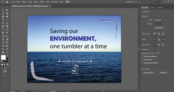
*Figure 6 At the end of the day, it is your choice: would it be worth it to start from scratch?
*A project to create wallpaper for a refillable bottle. Main advantage: customization and quality can be flexibly modified on such software: creativity is the limit.
5. Web-based services for digitally making graphs
Eventually using web-based services would come as alternative resort, thanks to its rich library of infographics and templates. There are a couple of handy services, namely “Mind the graph” and “Canva”, which both require extra subscription if one wants to access its full-fledged features. Designing with its basic features, albeit limitations, does not mean that the graphic would turn ugly automatically; Figure 7was successfully designed on “Mind the graph” standard feature, naturally with some fine tunings here and there. The call for upgrading the account from basic to premium one could come up later when things are becoming out of control, such as the necessity of downloading beautifully-prepared templates or saving the work at a much higher resolution.
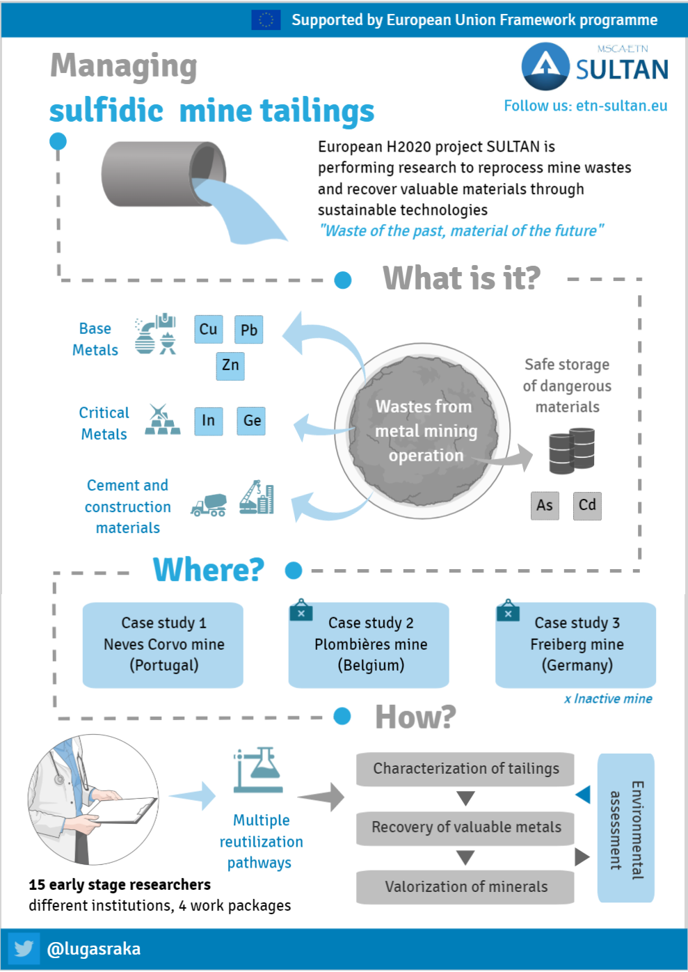
Figure 7SULTAN project in a glance: made on web-service tool
A small tip about web-based service: Before getting too overwhelmed with plethora of services available online, it would be better to master one and stick with it for some time. Yet, the choice of such, one service, highly depends on what kind of scientific illustration that you want to create. As an example, “Canva” is best known for its vectorized logos & marketing purposes while “Mind the graph” has its own advantages in diverse research & infographic templates.
6. Capturing all described guidelines: a summary
If you reach this point, then you are one consistent and passionate learner. I highly encourage everyone to once again look at the summary chart in Figure 8, as it provides wide view and planning of the illustration process itself. You may be wondering why is it written in the last part? Simply because the last graph is literally a condensed version of this article. So, you better not miss it!
My workflow of drawing images would be:
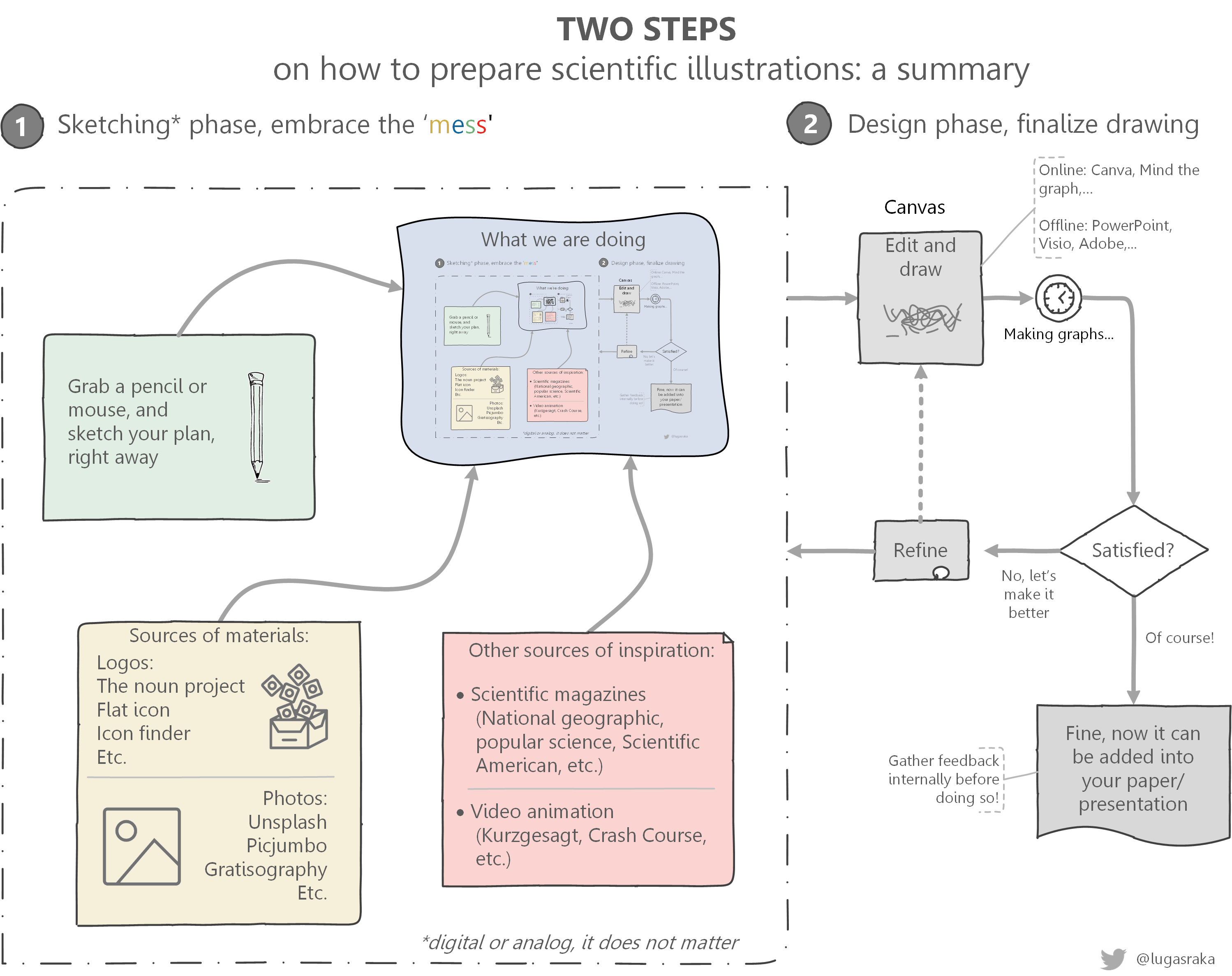
Figure 8 Some recipes and ingredients: making of scientific illustrations
Remember that, it requires a little touch and art feeling before you display the beauty behind your research. By any means, this tutorial is definitely unbinding – what works best for me would work differently for you. Getting exposed to various engaging illustrations, nonetheless, would stimulate a positive impact to enrich your arsenal, to spark creativity and to raise research traction in general. I imagine the whole process like playing Lego toys: you may have all the colorful blocks, but the results would depend on how you mix and design them – still, starting the process is much more essential. In the end, you would soon realize what are the takeaway of all these: you may have sketched (illustration) it for yourself, but your creation (research impact) is meant for someone else [8].
Did it stimulate your inspiration-seeking brain? If so, I would really appreciate to have a conversation related to our project (SULTAN, H2020) or about research stuffs in general with you. My online presence is accessible via @lugasraka (Twitter) or adrianto@ifu.baug.ethz.ch if you prefer a slightly static discussion.
References:
[1] R. Olson, Don't be such a scientist: Talking Substance in an Age of Style. Island Press, 2018.
[2] J. Madhusoodanan, "Science illustration: Picture perfect," Nature, vol. 534, pp. 285-287, 2016, doi: doi:10.1038/nj7606-285a.
[3] M. Litman. "Illustration Jobs: Who Pays Illustrators (And How Much)." https://www.format.com/magazine/resources/illustration/who-pays-illustration-jobs (accessed 22 July, 2019).
[4] N. Duarte, HBR Guide to Persuasive Presentations. Harvard Business Review Press, 2012.
[5] K. Perilli. "Making a Scientific Illustration." https://www.fi.edu/blog/making-a-scientific-illustration (accessed July 22, 2019).
[6] J. Christiansen. "Visualizing Science: Illustration and Beyond." https://blogs.scientificamerican.com/sa-visual/visualizing-science-illustration-and-beyond/ (accessed July 22, 2019).
[7] C. O. Coleman, "“Digital inking”: how to make perfect line drawings on computers," Organisms Diversity & Evolution, vol. 3, no. 4, pp. 303-304, 2003/01/01/ 2003, doi: https://doi.org/10.1078/1439-6092-00081.
[8] J. Corum. "Design for an Audience." http://style.org/ku/ (accessed July 22, 2019).
All images used in writing this article are self-made